On “Visualizing the Uneven Geographies of Knowledge Production and Circulation”
 Last night I had a chance to attend the Richard Bauman Lecture, a wonderful annual event in the Department of Communication and Culture at Indiana University that honors one of my teachers-turned-colleagues Richard Bauman. This year’s lecture was delivered by anthropologist (and friend of folklore studies) Don Brenneis of the Department of Anthropology at UC Santa Cruz. I hope to reflect more on his lecture soon, but some visualization graphics published in today’s issue of Inside Higher Education relate closely to his talk, which dealt broadly (and critically) with current transformations in knowledge work and higher education. He had come critical things to say about the growing hegemony of such processes (recently discussed here, on Savage Minds, and elsewhere) as Impact Factor analysis, journal rankings, etc. Subject to the kind of critique that Brenneis was offering in his talk, the three images published today in IHE also speak to the transformations that he was describing.
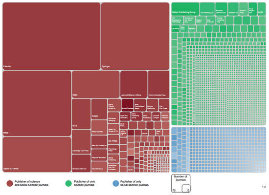
Most relevant here is the way that the third graph (shown above) pictures the scale and centrality of the big five commercial publishers that I also discussed in the recent post that has gotten so much attention from readers (thanks all). Everyone should look at the original images in IHE, but the one shown in a small format above is the third of the three. The five largest rectangles represent Elsevier (upper left corner), Springer (to Elsevier’s right), Wiley (middle left), Taylor and Francis (bottom left) and Sage (on the inner corner adjacent to Elsevier, Springer, and Wiley). These are the same five who between them control just under half of the anthropology journals tracked and ranked by Thompson Reuters for such metrics as Impact Factor and Half-Life. I point to the image here because it speaks to the dominance of these large firms over all of scholarly publishing. Burying the lead again, I’ll just say that I resist rather than stand with these publishers.
Visualizing the uneven geographies of knowledge production and circulation – Inside Higher Ed.
PS: I should have noted that the IHE gleaning comes originally from a full report:
I consulted the original version of the image shown above to see who some of the smaller publishers shown are. Not-for-profits who are large enough to be labeled include Annual Reviews and the University of Chicago Press (about the same size) and slightly smaller, MIT Press and Johns Hopkins University Press. Chicago, MIT, and JHU are among the largest of the university press journal publishers. It is in the nature of the visualization that the many smaller publishers are represented with squares/rectangles that are too small to label.


